In 2015, Microsoft reported that human attention span had dropped from 12 seconds in 2000 to around 8 seconds. With over 1.7 million self-published books released every year in the U.S. alone, your book has only one chance to make a first impression.
Tough? Absolutely.
But not impossible.
Especially in the U.S. market, where competition is intense and everything is digital. Readers are scrolling, browsing, and clicking at the speed of light. They skim covers, judge quality instantly, and decide within seconds.
So, what does it tell you?
If your reader does not understand or get attracted to your book cover within two seconds, chances are they’re moving on. You must be thinking, “but hey, what happened to don’t judge a book by its cover?”
Well, honestly, this “advice” is absolutely trash (for both life and actual books.)
People do, and I believe they should judge a book (and a person:👀) by the covers. A book cover is a sales tool. It’s your silent salesperson working 24/7, convincing readers to stop, click, and hopefully buy.
So, to help you out. I’ll break down every single element that makes a cover sell, explain why each part matters, and share examples. By the end, you’ll know exactly how to design a cover that can get the attention of even the most distracted reader.
The design of your book’s cover matters because it's the first visual impression a potential reader gets, and it can significantly impact whether they choose to pick up and read the book.
A writer could have written the greatest masterpiece history. But unfortunately, a reader won’t be able to see that brilliance if the cover doesn’t draw them in.
A book cover:
There are three things to consider when working on book cover design. Let’s look at each of them individually.
Your front cover is arguably the most important part of your book’s exterior. It is the first impression, visual pitch, and marketing hook all in one. A strong front cover typically consists of two main elements: Imagery and Typography.
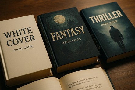
Imagery can take many forms:
It should impact the mood of the reader by giving them a hint about what your book is about. Basically, show – don’t tell in a way that builds curiosity in people.
Fonts aren’t decoration — they’re voice. A horror font is jagged and unsettling. A romance font is soft and flowing. A nonfiction font is clean and professional.
What is the Biggest Mistake to Avoid? Believing “too many means better.” It is not. Mixing too many fonts is a bad idea. A good rule of thumb is to use just two fonts. One for the title and one for the author's name.
A great example of this is Stephen King’s IT. He used a bold, simple font that screamed horror without needing extra graphics.
Now, if you compare it with some indie horror book cover design that has four fonts crammed in, you will understand how weird and absolutely amateurish it looks.
The back cover is a valuable marketing tool that supports the front and helps seal the deal for potential readers.

Typically, the back cover includes:
Your description and reviews should take priority; they are your top-selling points, while the bio, ISBN, and barcode can be placed toward the bottom.
If you're publishing a hardcover, consider using the interior flaps of a dust jacket for some of this content. This info usually appears on the book's online product page for eBooks.
When a reader looks at your book cover, their brain processes color before it processes words or any illustration.
That’s why color psychology is one of the most powerful tools you need to use wisely when working on a custom book cover design.
The right color choice can trigger emotions, signal genre, and even push a hesitant reader toward buying.
2D illustrations communicate instantly. A flat envelope icon says “email” without explanation. A 2D symbol with bold outlines is recognizable even in your peripheral vision. However, although 3D can be impressive, it sometimes sacrifices clarity for realism, something mobile users don’t have time for.
This one’s closer. 3D can wow us with realism, but 2D has the advantage of relatability. A hand-drawn smile, a quirky doodle, or a playful flat symbol feels more personal, approachable, and, dare we say, human. That warmth matters when you’re trying to stand out in an endless scroll of digital noise.
Blue: This color is greatly associated with trust, stability, and calmness. It is a popular choice for business, self-help, and memoirs because it suggests professionalism and reliability.
Red: Signals urgency, energy, danger, or passion. Thrillers, romance, and political books often use red to stand out. For instance, The Da Vinci Code by Dan Brown. This book has been reused more prominently. This instantly creates tension and excitement.
Yellow and Orange: These colors are bright, friendly, and considered optimistic. These colors work well for memoirs, motivational titles, and humor. They radiate warmth and make books look approachable.
Black and White: Minimal, modern, and dramatic. These covers often appeal to readers who like literary fiction, philosophy, or edgy non-fiction. They suggest sophistication.
Green: This color instantly reminds people of nature. It signifies growth and renewal, too. You will see these colors on environmental titles, wellness guides, or books linked to health and sustainability.
Now, why am I telling you all of this?
This is primarily to help you understand how the human mind associates emotions with colors. So when you are designing your book cover, what do you need to do??
You do not just pick a random color or your favorite color. Think wisely and ask yourself, what emotions do you want your cover to trigger in a distracted reader?
This will help you pick the right color for your cover.
The spine might seem like a small detail, but it plays a big role in discoverability, especially in bookstores and libraries where that's often the only visible part of your book.
Make your spine design count by including:
Keep in mind that the width of your spine depends on your final page count.
That’s why it’s smart to finalize your interior file before beginning the cover design, so the spine dimensions are accurate and don’t need to be redone later.
Did you think that you could use the same book cover for an online store? Hehe nope. Now here is something you need to do: When you sell your book online, the rules of cover design change. Readers usually scroll through dozens of options at once, which means that your cover only has a split second to stand out.
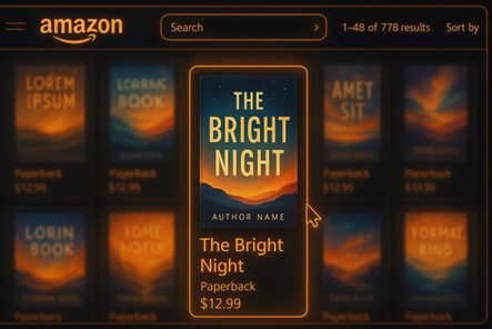
Unlike a physical bookstore where people can pick up your book, flip it over, and feel its texture, online buyers make their decision based almost entirely on a tiny thumbnail image.
Key things to remember for online cover design:
Thumbnails rule: Your cover might appear at just 100 pixels tall in search results. If the title and imagery aren’t clear at that size, readers will skip right past it.
Bold fonts are essential: Going for soft or thin fonts is a bad idea. Why? Because they can get lost on small screens. Strong, clean typefaces make sure your title stays readable.
High contrast works best: Light text on dark backgrounds (or vice versa) catches the eye faster than muted colors that blend together.
Simple imagery wins: Small details, line drawings, or overly complex artwork might look impressive at full size, but will vanish in thumbnail view.
Design for mobile first: We can not tell you how absolutely important this is. Almost every person today browses and searches on their phones. So, you need a cover that not only opens at your phone but also grabs their attention in one second, all while surrounded by multiple book covers.
Before you open Canva to find the best book cover template or call a designer, research your genre.
Study Amazon’s Top 100: Screenshot the covers. Try to analyze them. Closely look at the fonts, colors, and images that are used.
Look at BookTok & Instagram: Listen, please remember that BookTok can make or break your book. If you pay attention to the covers readers share there, you’ll notice they often have certain similarities. The elements aren’t identical, but the patterns are clear.
When working on your novel cover design, make sure you incorporate those shared elements so your book feels like it belongs in the conversation while still standing out.
Visit bookstores: Notice which covers catch your eye from across the room. Look at what is so interesting about it.
A good tip is to build a Pinterest board with 30–40 covers you admire. You’ll see patterns emerge that will tell you what your readers expect and want from your cover.
Not all books fit neatly into one genre box. Some might straddle historical fiction and romance, or science and personal development.
When that happens, your front cover design becomes even more critical. You have to choose which genre you want to highlight visually.
Ask yourself:
If your custom book cover design confuses the audience, you risk losing potential buyers who aren’t sure what they’re getting into.
Is your book:
The tone of your book should be mirrored by the book cover illustration and overall style. For instance:
Readers are drawn to stories that match their emotional expectations. Your cover helps set that expectation, so don’t confuse a potential buyer with a mismatched mood.
Yes, design is a creative field, but certain principles never go out of style.
Use them to your advantage.
Remember! An effective novel cover design draws the eye and directs attention in the right order: first title, then subtitle, then author name, then image.
If you are working with the best book cover design services, then you do not have to worry about these details. But hey, knowing or understanding them has no harm, right?
DPI: For print, your cover must be at 300 DPI. Anything lower will look pixelated and unprofessional.
Bleed: Printers trim books after printing. If your design goes right to the edge, you need to extend background colors or images 0.125 inches beyond the trim size on all sides. This ensures you don’t end up with unexpected white lines around the edges.
Trim size: The most common paperback size in the U.S. is 6x9 inches, while many children’s books are 8x10 inches. Always set your cover dimensions based on your chosen trim size.
File format: Print = For print, use PDF/X-1a (the industry standard that locks fonts and images in place). For digital, most platforms accept high-quality JPG or PNG.
Color mode: Print requires CMYK (Cyan, Magenta, Yellow, Black), while digital screens use RGB (Red, Green, Blue). If you upload an RGB file for print, your colors will shift.
Whenever you read a blog about book covers, you'll find a section on mistakes to avoid. I thought if everyone else is writing about it, I should too. But honestly, I'm tired of seeing the same mistakes mentioned in every blog.
This is why I have come up with some new ones that I have personally seen people making. Hope this helps you, too.
1. Forgetting the Subtitle (When You Need One)
A subtitle is not always required, but for nonfiction especially, it can make or break sales. Without it, your title may feel vague, confusing, or too generic.
A subtitle gives clarity and SEO power. Online stores use subtitles for keyword searches. This means that if it is a missing or weak subtitle, it will impact your book’s discoverability.
2. Weak Author Name Placement
Some covers treat the author’s name as an afterthought. This means that they either write it too small, hide it in a corner, or compete with other text.
Now, here is what you need to understand about the writer’s name. Readers often buy based on familiarity. Even if you’re a debut author, training your readers to notice your name builds long-term brand recognition.
A great example of this is Colleen Hoover’s covers. She always places her name prominently, which helps her brand snowball across every book release.
3. Inconsistent Series Design
One of the main reasons books in a series don’t sell well is when the covers don’t look similar. Readers like things to feel connected, and different-looking covers can make them think the books aren’t part of the same series.
Readers browsing online will skip book two if it doesn’t look like a sequel to book one. Series branding directly affects binge-read sales.
Just take Harry Potter as an example. If you pick up each edition of the series, you will see that they use cohesive fonts and illustration styles. That is exactly what you want to achieve.
4. Ignoring Target Demographics
It’s not enough to signal a broad genre; your cover should also match the tastes of your specific audience.
A YA fantasy aimed at teenagers won’t sell if it looks like a literary classic meant for professors. Covers should mirror the design language your intended readers are already attracted to and love.
5. Amateur Tagline Placement
Using a tagline or short phrase can create interest, but if it’s not placed well, it can mess up the overall look. If the tagline gets more attention than the title, it can make things hard to read.
If it’s too small or placed too low, it doesn’t help at all. Think of your tagline as a helper. It should support the title, not take away from it. Place it above or below the title in a smaller, lighter font.
6. Ignoring Competitor Research
Many authors design in a bubble, creating what they personally like without comparing it to what’s currently selling in their genre.
Covers don’t live in isolation. Your book will sit next to dozens of similar titles online. If yours doesn’t “fit” with the shelf, it risks being skipped.
7. Overusing Self-Photos on the Cover
Many memoir authors want to put their own photo on the cover. Sometimes this works (mostly only when you are a celebrity or someone famous), but often it backfires. It happens because your face is not the selling point. Yes, Michelle Obama’s face is the selling point – but sorry, yours is not.
This is why it is always best to go with symbolic or artistic imagery, which often resonates more with strangers.
Book cover design constantly evolves, but several key trends and themes appear in popular book covers. Let’s explore.
Clean, uncluttered, and striking. Minimalist covers use white space, one color tone, and sharp focus on the title or a central image, which is especially effective for eBooks.
For example: In Pursuit of Grit by Darrell Williams.
Trendy, youthful hues that pop. These colors grab attention and are ideal for covers aimed at modern, social media-savvy readers.
For example: Everything I Know About Love by Dolly Alderton.
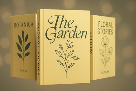
Floral and plant motifs are blooming across genres. They add elegance, mystery, or vintage charm and often weave through or obscure text creatively.
For example, here is Advice from Baba Yaga by Brenda L Baker.
Imagery and typography merge into one. Titles interact with graphics—wrapping, hiding, or slicing through the letters to create depth and intrigue.
For example: Mexican Gothic by Silvia Moreno-Garcia
Authentic and emotional. Real-life images (not stock!) connect readers instantly and bring realism to memoirs, historical fiction, or nonfiction.
For example: Anne Frank: The Diary of a Young Girl.
Designing your DIY book cover can be rewarding, but it’s not for everyone. If you’re struggling to bring your vision to life or are worried about quality, consider hiring a professional book cover designer.
An expert will know how to:
Even just a few hours with a pro can make a difference. Take it as an investment, not an expense, especially if you aim for high sales, wide reach, and lasting impact.
Designing a book cover that sells, especially in today’s oversaturated U.S. market, is both an art and a science. It requires more than just slapping on a title and a stock photo.
Ask:
Whether you design a book cover from scratch or invest in a custom book cover design, the most important thing is that your cover communicates your book’s promise and pulls people in.
Looking for more information? Call us at +1 (855) 521-5040 for quick support!


Have a project in mind? Reach out to us, and we’ll help turn your ideas into stunning illustrations.
Tell us what you need, and we’ll create a custom illustration just for you. Reach out today and let's get started!

Copyright © 2026 360 Illustration House | All rights reserved. Terms And Conditions | Privacy Policy | Refund Policy
